A bad web design can lead to a lower SERP score in the Google results. Therefore, it is important to adhere to certain fundamental design principles that are recommended. In this blog post we go through a few mobile design best practices.
1. Spacing between interactive elements
Interactive/touch elements like buttons and links shouldn’t be too close to each other. Otherwise, a user can accidentally press the wrong option. This is especially important for people with a motor impairment.
If this happens, then Google’s Mobile-Friendly Test tool will report this as: “Clickable elements to close together”. To prevent this from happening, you need to make sure that there is enough space between multiple clickable elements and that there is enough padding. A fingertip should comfortably be able to press it.
2. Proper text size
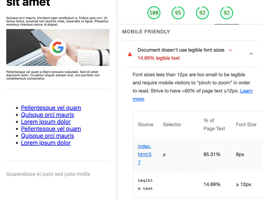
This tip is kind of self-explanatory. The font-size on your web page must be large enough for users to read. If it’s too small, then Google’s Mobile-Friendly Test will report this issue as: “Text too small to read”.
3. Content wider than screen
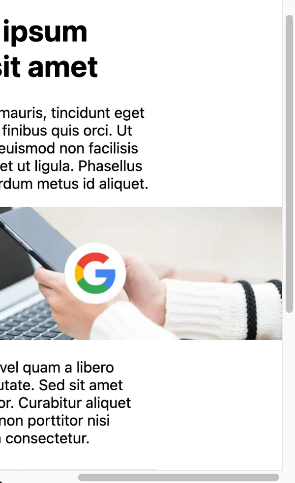
When the content on your website is too wide, users must scroll horizontally to view all the content. Google sees that as a bad user experience. Its Mobile-Friendly Test will say: “Content is wider than screen”. To fix this you must design your webpage in a way that it is (fluidly) responsive: Adjust and scale content based on the width of the viewport.
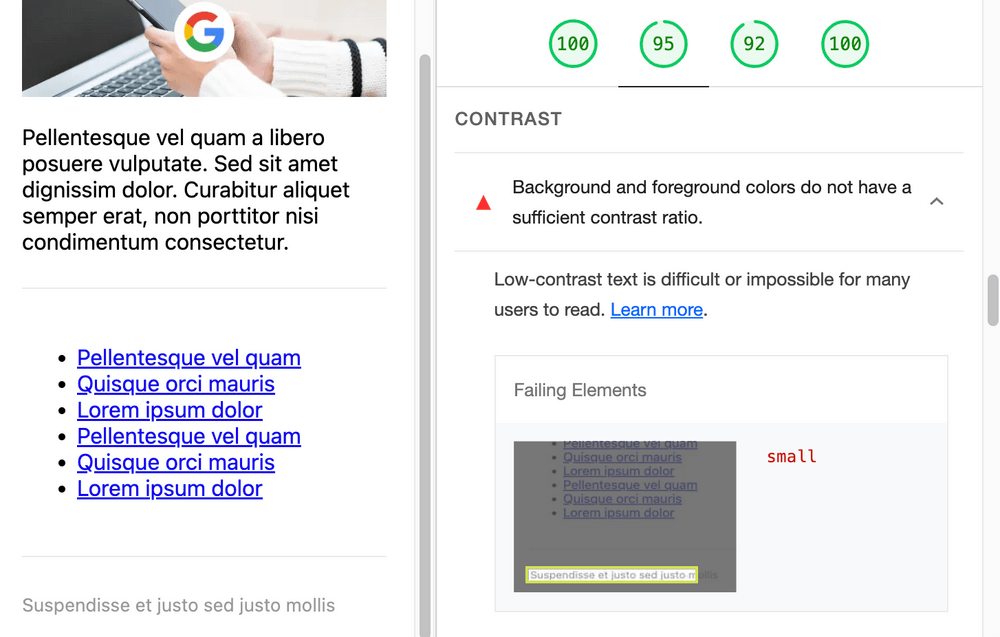
4. Contrast ratio
If the contrast ratio between colors on your website is too low, then it’s hard to see your elements. Especially for people with color blindness. A good resource for checking if contrast ratios are good enough is WebAIM’s Contract Checker.
Conclusion
These were four mobile design tips that’ll help rank higher on Google result pages. However, there are more design principles for better SEO. We will write about those in future blog posts. For more information about design principles in combination with SEO, check out PageSpeed Insights and Google Search Console.

